Snow Swaps Mobile Market
Methods Used: Cognitive Walkthrough, Research Protocol, Remote Contextual Inquiry, Prototype Design
Tools Used: Sketch, Zoom, Slack, Google Docs
Snow Swaps before the Project
Client
Snow Swaps is virtual marketplace connecting winter sport enthusiasts looking to buy and sell winter gear. Everything from children’s skis to adult’s jackets are available on the site. It is currently still in development and will be launching soon.
Problem
Snow Swaps is a niche tool in a crowded marketplace with very powerful players. Facebook and craigslist have dominant market share in this arena. For Snow Swaps to be successful, it needs to be better than its competitors. We were tasked with creating a prototype of recommend changes to this mobile website.
Solution
After a Cognitive walkthrough and Remote Contextual Inquiry a prototype featuring recommendations was submitted to the client.
Research
Cognitive Walkthrough
To begin my research, I started with a cognitive walkthrough. I wanted to understand the current status of the website. I evaluated tasks from the design brief sent by the client and uncovered opportunities for improvement across the site.

Research Protocol
The next step in my research was to design a protocol for remote contextual inquiry. While I enjoy hitting the slopes on a brick Minnesota day, I am not the user for this website. I had a lot to learn about ski clubs, racing teams and the world of ski swaps.
Because the client is looking to launch in a crowded competitive marketplace, I started this protocol with questions exploring the users relationship with those competitors. I wanted to understand what our users both liked and didn’t like about those websites. Also, I included questions about the life of the user. I wanted to understand what it was like to be the parent of a fast growing teen on a ski racing team.

Contextual Inquiry
While participants shared their desktop over zoom, my team and I conducted 3 remote contextual inquiries. As a notetaker in these sessions, I payed close attention to listen for pain points, both in the programs in their life as a user.

Key takeaways from my research
Discovery: The user only interacts with these types of websites right before ski season starts, then not again until the next season.
Impact: That means we need to design the site expecting users have forgotten how to interact with it.
Discovery: Parents are dissatisfied with the current competitors in the marketplace, single users without children are not.
Impact: Time and energy should be uses to maximize the value focused to parents. They will be the best target market when the website launches.
Discovery: Users have no confidence in current sites.
Impact: Knowing that the users want to have confidence in the program helps us make choices to maximize for that value.
Design

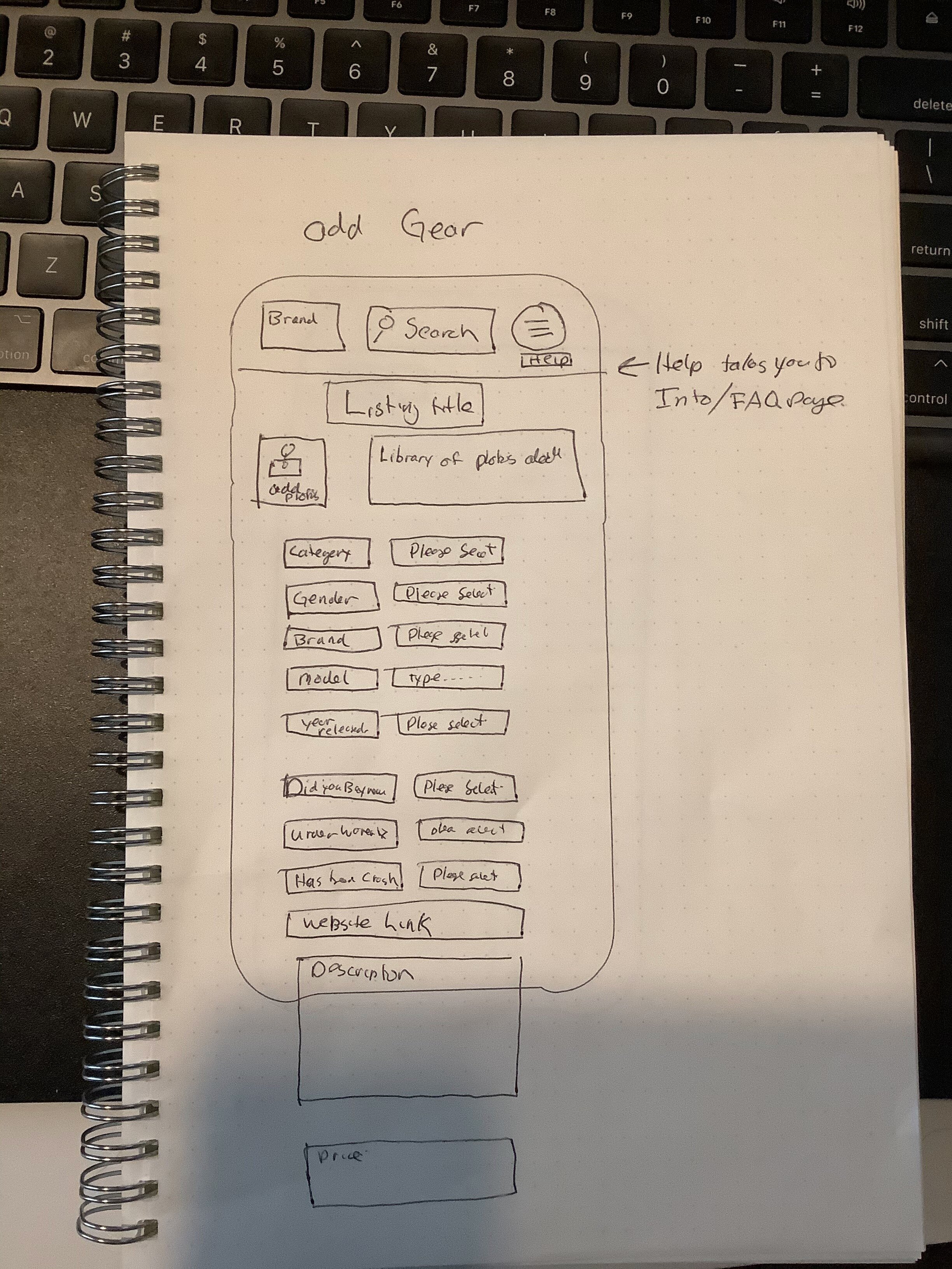
Wireframe
To design recommendations for the mobile website, I started with my pen and notebook. I focused on changes to bring confidence to the user.
I focused on:
Login Process
Navigation
New Screens
Selling Process
Shopping Process
Profile
Prototype
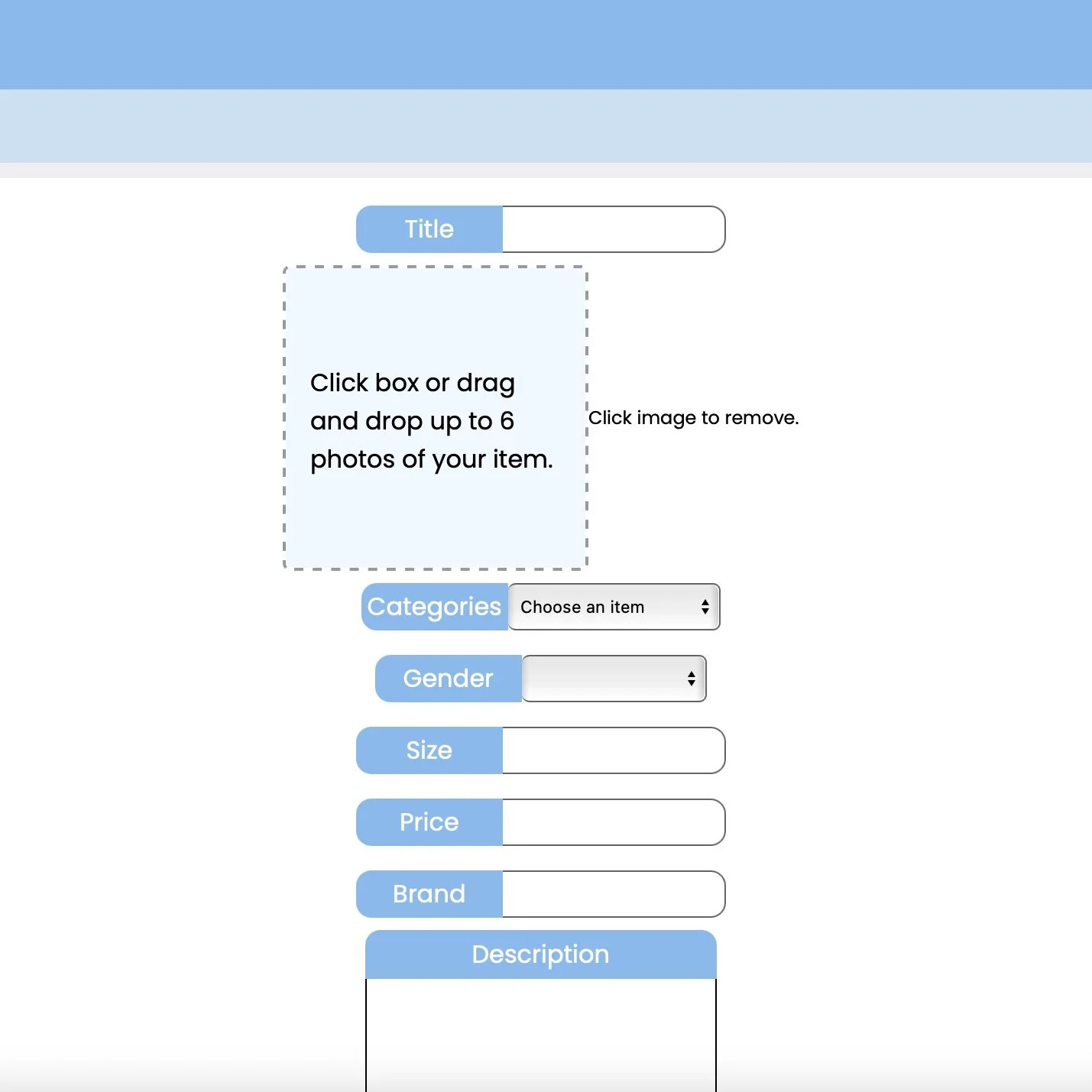
After the final revision to the wireframes in my notebook, it was time to digitize them using sketch. I worked within their current brand colors, icons and site architecture. I wanted to unsure changes I made both brought value to the users as well as stayed within brand for the website. As someone who use to work in marketing, I understand how important the brand experience is.
Prototype Recommendations
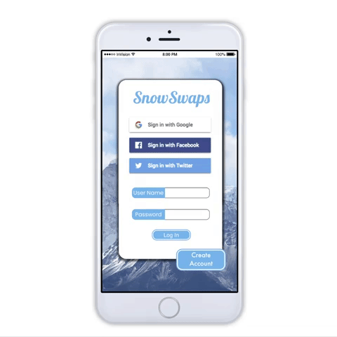
Easy Login
Before: You could not access the website without remembering your username and password from last year.
What’s New: Adding 3 new login methods to the website. Users can chose to create an account, or use their Facebook, Apple, or Google accounts.
Why: Research revealed that our users only use this website before ski season starts, then not again for another year. Its too much of an ask to create a unique login and password to remember a year later. Using an existing credential simplify things for the user.
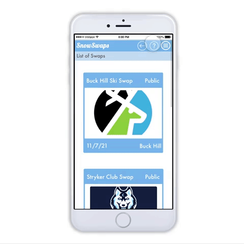
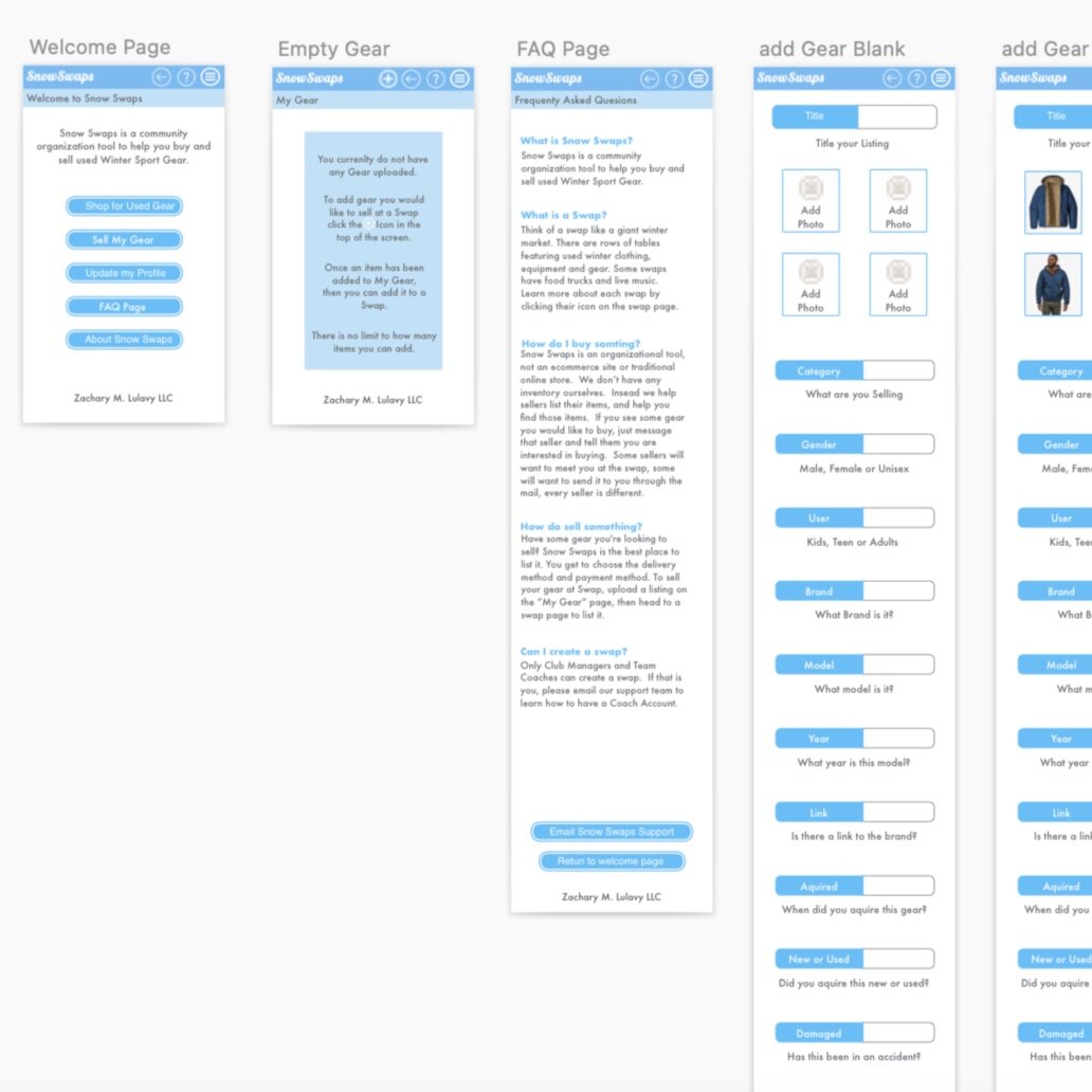
Intuitive Navigation
Before: Navigation was limited to a drop down menu in the upper right corner.
What’s New: A back button and help button has been added to main navigation.
Why: Users feel more confidant in clicking when they know they can “go back” or undo an action. The help button is there with guidance on how to interact with the page.
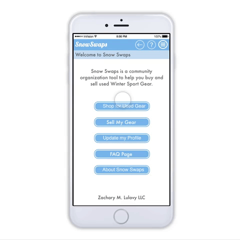
New Screens
Before: Users had no guide on how to use the website or a way to ask questions.
What’s New: 2 new screens were added. A new welcome screen is the first screen users see after they login. This screen has a simple overview of the app and buttons to guide the users next action. Also, a centralized FAQ page is home to answers for most of the users questions.
Why: The welcome screen and FAQ page were both added to help the user feel confidant they knew how to use the website.
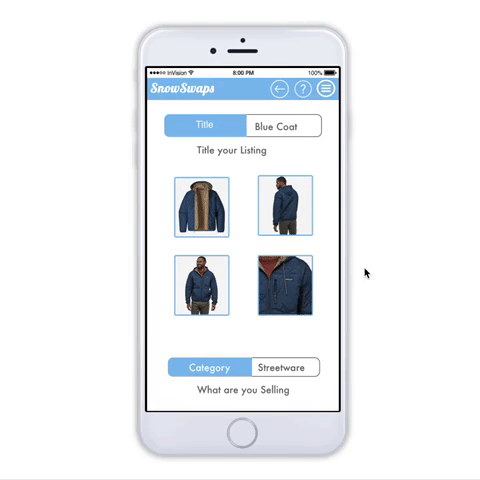
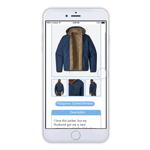
Guided Selling
Before: Listings were incomplete or did not accurately represent the item being sold.
What’s New: Additional categories recommended by our research participants, microcopy to help users fill out the listing form correctly, and a new layout to highlight the multiple photos.
Why: Research revealed our users struggled with what to enter into their listing. The new categories and microcopy helps users understand what to put into their listing. Users can now feel more confidant about selling their gear.
Personal Profile
Before: Profiles were simply names and a photo.
What’s New: An “About Me” section is added to the profiles.
Why: Users feel more confidant in the transaction knowing who they are doing business with. Research revealed our users were worried about who they were buying from in the past.
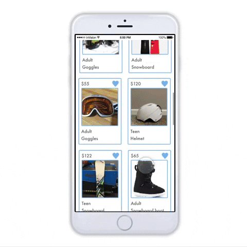
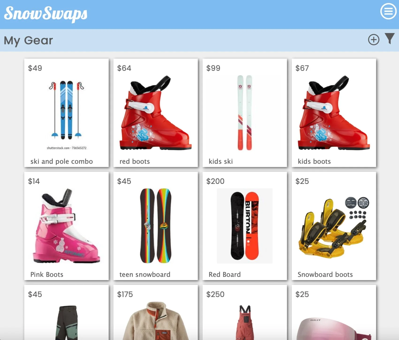
Simplified Shopping
Before: Titles of a listing were a user generated tagline that often did not do enough to describe the item.
What’s New: Titles are now restricted to Price, Category, and Size. They are pulled directly from the listing itself.
Why: The previous titling system did not help explain the listing. Users now have more confidence shopping, knowing what they are clicking on.