Provision
Methods Used: Secondary research, Comparative Analysis, Survey, Kano Analysis
Tools Used: Figma, Canva, Zoom, Slack, Google Docs
Teamwork: I worked with 3 other UX designers to bring Provision to life. Work was done collaboratively, please see callouts “MY ROLE->” where I highlight specific contributions.


Client
Innuevaion is a fintech company offering a multifaceted array of services to meet the growing banking needs of its users. One key feature of the Innuevaion suite of services is called Provision. Provision is a web application designed to inspire generosity in its users.
Opportunity
The client knew what he wanted Provision to do. He wanted to help his users underdsand their finances, inspire his users to be more generous and offer a personalized experience. Here was the opportunity, he did not know how to do that or what would look like. The client had an idea for his fintech software, it was up to my team and I to bring it to life.
Project Pivot
Our client wanted us to “gameify” generosity. AKA he wanted Provision to assign points to users for donating time and money. Our user research overwhelmingly rejected this concept. This caused us to pivot. Instead of gameifying generosity, we created a system to encourage people to level up their communities.
Solution
The key to unlocking Provision came because of our pivot. Free from the idea of points and games, we created a system to look at time in the same way other fintech looks at money. Time, and available time could be charted, graphed and displayed just like money and traditional budgets.

Research

Stakeholder Interview
After studying the creative brief, the team and I met with the client for a 2 hour Stakeholder Interview.
MY ROLE-> I led the Stakeholder Interview

Survey
Our First survey had 57 responses from potential users. One key result that stood out to us was 60% of respondents are looking for ways to improve their charitable giving habits. This was good as it showed there was a viable audience for the client to engage with.
MY ROLE-> I edited questions and added stock photography to the survey so responds would have a more enjoyable experience.

Kano Analysis
Our second survey, a Kano Analysis that calculated the desirability of features, revealed that our users expected to have multiple ways to visualize and access data. It also told us having a customizable dashboard was a feature that delighted and surprised users. These results directly lead to the design design to create a very customizable experience.

Comparative Analysis
Part of our secondary research was to explore other fintech that had similar goals to our client. Each team member researched several competitors and shared our findings on an Invision board. We could not find a web application that combined Money Management, Volunteering and Donating.
MY ROLE-> I researched several competitors

Proto-Personas
Using the results from the first user survey I created 4 prototype-personas to help us strategize content for Provision.
MY ROLE-> I created the personas.
Client’s Goals

Understand Finances
Our client is passionate about helping users and wants all of them to be on a path to better financial stability.

Inspire Generosity
Generosity is the backbone of this project. The client wants to use this fintech web application to make the community a better place.

Personalized Experience
Our client wanted users to be able to create a personal experience in Provision.
The Pivot

Level Up the Community
The idea of turning every day tasks into something fun with a game is a buzzworthy concept in the technology world at the moment. The Client’s initial research suggested we find a way to “gamify” provision and assign points for donating. Our surveys revealed that is not something our users wanted. Instead of the gamification of generosity, we changed the concept. Now, users would work to level up the community.
Strategy

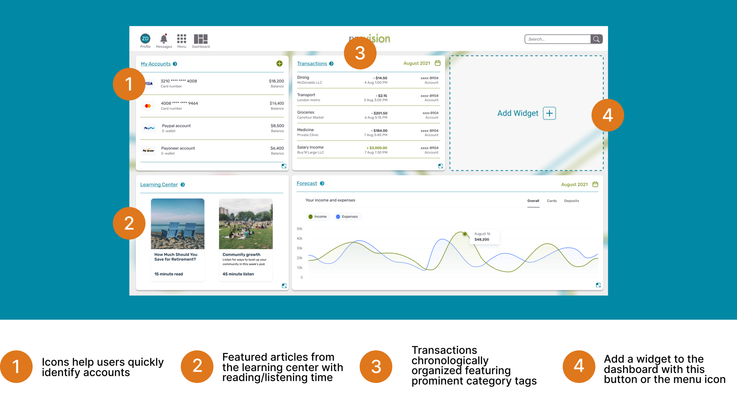
Learning Center
To help users understand their finances
In our first survey, 56% of potential users stated they wanted help with finances. Our client was very passionate about helping these users. He wanted all of Provision’s users to have financial stability. To support that goal, we added a learning center featuring podcasts, articles, and videos. This media would be produced by Provision and center around growing wealth and reaching financial stability.
MY ROLE-> I created original wireframes for this feature.

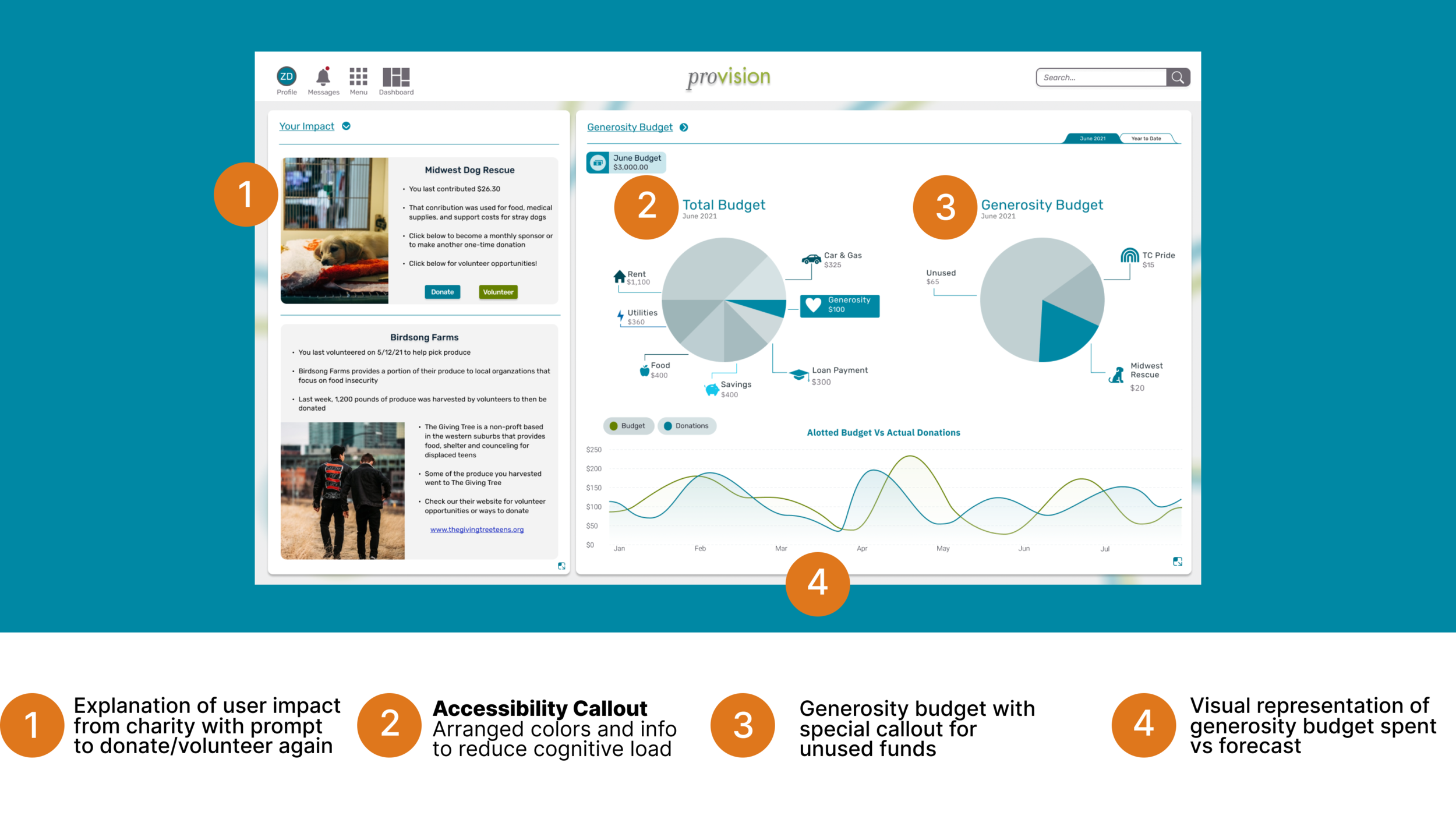
Data Visualizations
To help users understand their finances
Fintech programs have a lot of information they need to get across to users who can feel overwhelmed by it at times. We created date visualizations that were clear and straightforward. Familiar brand icons were added to help orient the user.

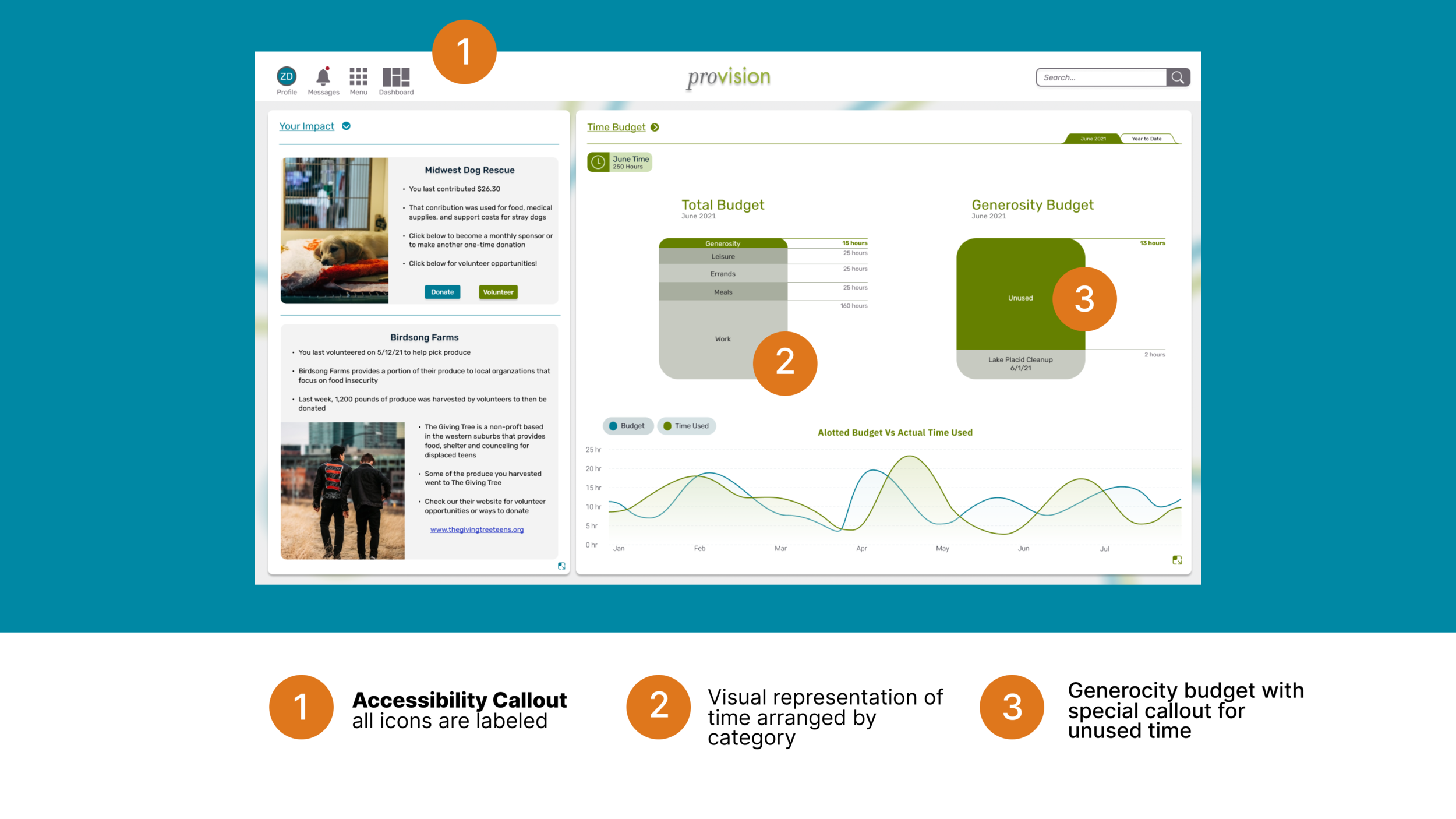
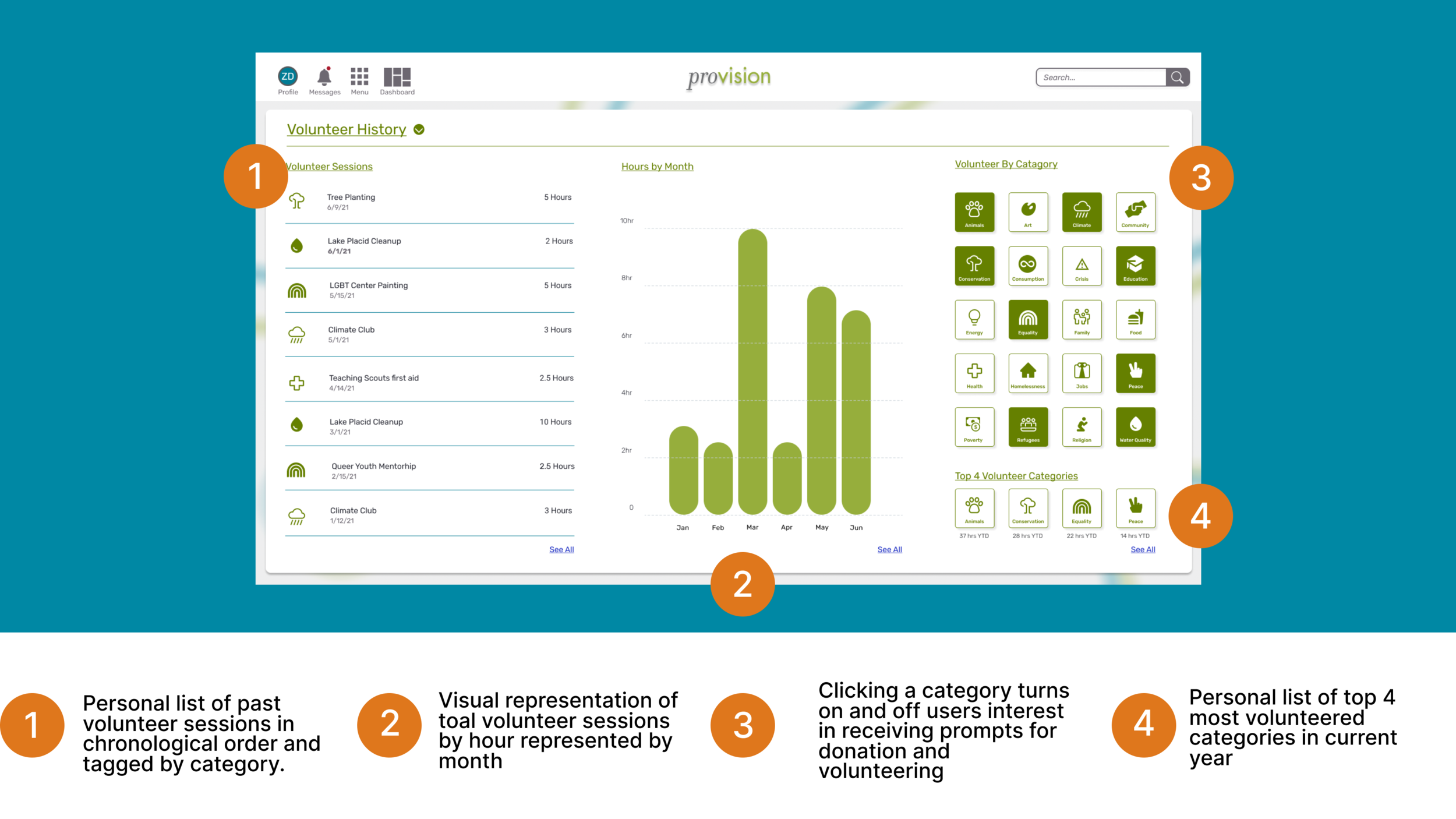
Donating Time
To Inspire generosity in users
Not everyone has the money to donate. In our survey, 60% of potential users were looking for ways to improve their charitable giving habits. As an alternative to donating money, users were encouraged to donate time. Time then needed to be graphed, visualized and forecasted in a similar way to money. We designed a widget to show users how much available time they could have to focus on generosity.
MY ROLE-> I created the high fidelity wireframes for the prototype

Impact Map
To Inspire generosity in users
Part of “leveling up the community” is showing how the community is being impacted by users of Provision. Once a user has logged volunteer hours, they will appear in this community impact map.

Personal Causes
Creating a personalized experience
Using the results from an onboarding survey, Provision will use what it leaned about the passions and interests of its users to create personal recommendations for places to donate time and money.
MY ROLE-> I created original wireframes for this feature.

Widget Mangement
Creating a personalized experience
Our Team created 13 different widgets for the users. and a new menu to organize them. Each widget was available in different sizes for the user to choose. We created a fully customizable experience.

Design for All
In my practice, i’m passionate about Accessible Design. Our team consulted with an accessibility expert to ensure our design was accessible for all. From our consultation we updated 3 main areas for accessibility.
labeled icons, so all users clearly understood their intentions
confirmed color contrast of text and charts, so users with low vision or colorblindness com interpret the data
reduced clutter and simplified content to reduce cognitive load on users
The slide to the left is from our prevention deck.
Users
Our team held 3 remote usability tests on our features. These two quotes really stood out to our team.


Deliverables
At our handoff meeting, we delivered our client
Video Presentation
Presentation Deck
Copy of Figma Files
Annotated Wireframes
Research Report
Survey / Kano Analysis raw results
Architecture Diagram
Video Presentation
Our team gave a 14 min presentation about our project. Many of the slides from that deck are used in this case study.
MY ROLE-> I created the presentation deck and sections of the script.

Annotated Wireframes
Our findings and recommendation report included a section of Annotated Wireframes. These annotations centered around accessibility callouts, new feature highlights and content strategy.
MY ROLE-> I created all the Annotated Wireframes
Architecture Diagram
We also included an Architectural Diagram of our new widgets in the findings and recommendation report.
MY ROLE-> I created the final version of the Deliverable