
Harmony Farms Case Study
Methods Used: Heuristic Analysis, Research Protocol, Remote Usability Study
Tools: Zoom, Google Docs, Canva, Keynote
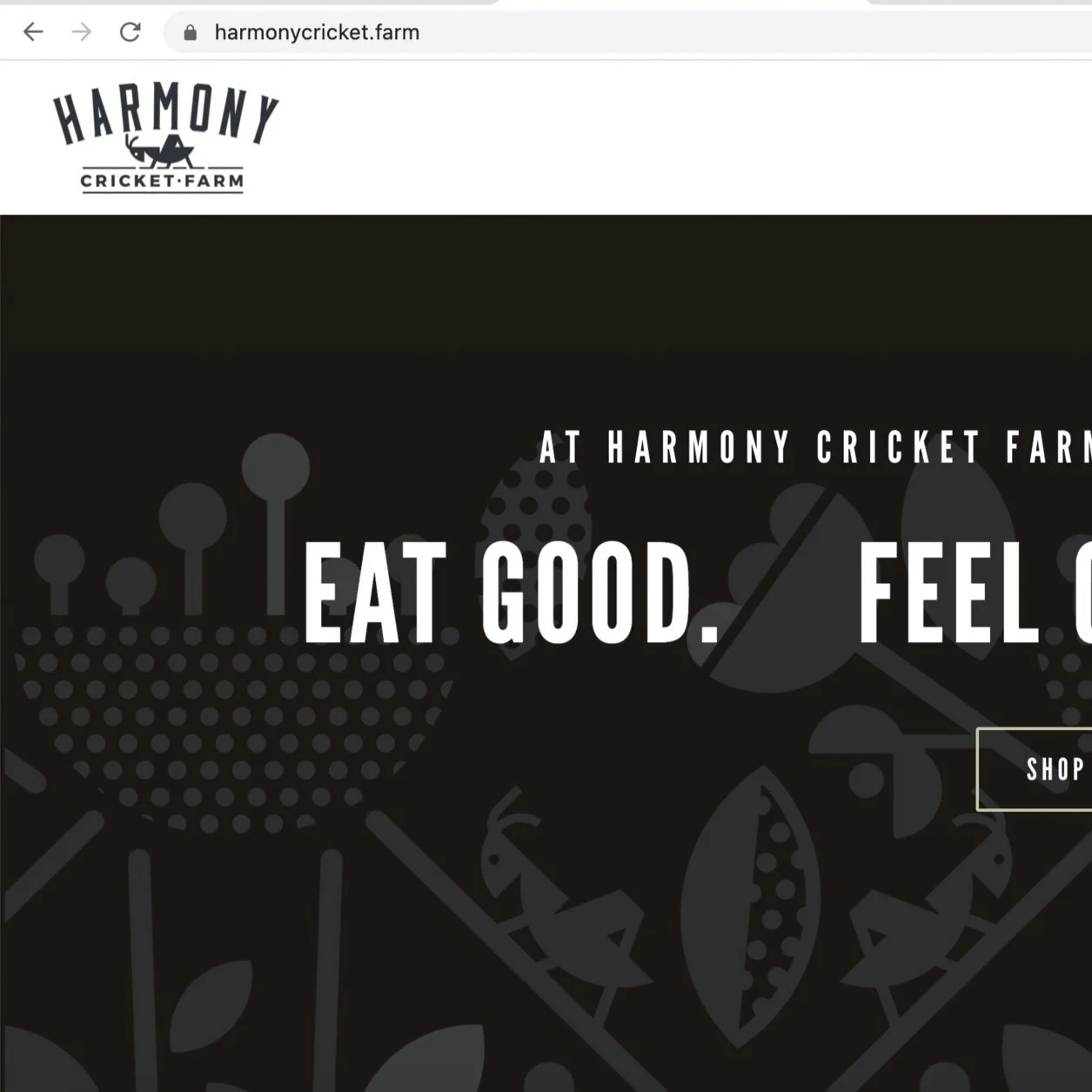
Harmonycricket.farm
Client
With offices in NE Mpls, Harmony Cricket Farm sells crickets as food for human consumption. Their current product line features protein powder, flour and cookies. Each one of these products is made with crickets. Their online store is their primary retail presences, with the occasional pop-up at a Farmer’s Market.
Problem
Harmony Cricket Farm is preparing for a market expansion. In Preparation, they wanted an audit of their website to discover and fix any problems before spending money on ramping up production and marketing.
Solution
After a heuristic analysis, and remote moderated usability study, it was discovered that changes to the website organization, legibility, engagement, transparency, and accessibility were recommend. A report featuring recommendations was submitted to the client.

Research

Heuristic Analysis
After Receiving the creative brief from the client, my first step was to do a heuristic analysis using Shneiderman’s 8 Golden Rules of Interface Design.
The Heuristics I measured for were:
Strive for consistency
Seek universal usability
Offer informative feedback
Design dialogs to yield closure
Prevent errors
Permit easy reversal of actions
Keep users in control
Reduce short-term memory load
Research Protocol
The next step in my research was to design a protocol ….

Usability Study
While participants shared their desktop over zoom, my team and I conducted 3 remote usability studies. As a notetaker in these sessions, I payed close attention to listen for pain points, both in the programs in their life as a user.

Key takeaways from my research
Organization: Participants could not find answers to their own questions on the site, a new Hierarchy of existing information can help fix this.
Legibility: Participants struggles to read some of the copy, updating format, copy and font size can help alleviate this.
Engagement: Participants were disappointed when engaging with the blog and nutritional information, a new format, organization and titles can help energize this.
Transparency: Participants wanted information if that was not available on the site, new copy can help address this.
Accessibility: Participants using screen readers would not be able to understand important parts of this site, removing .jpg files containing text will solve this.

Deliverable

Report
The report I submitted to the client featured the 5 key findings divided into observations and recommendations. I included screen shots of both the observations and well as recommendations. To help Harmony Cricket Farm implement the recommendations, I included a section were I organized the recommendations by difficulty.

Recommendations

Organization
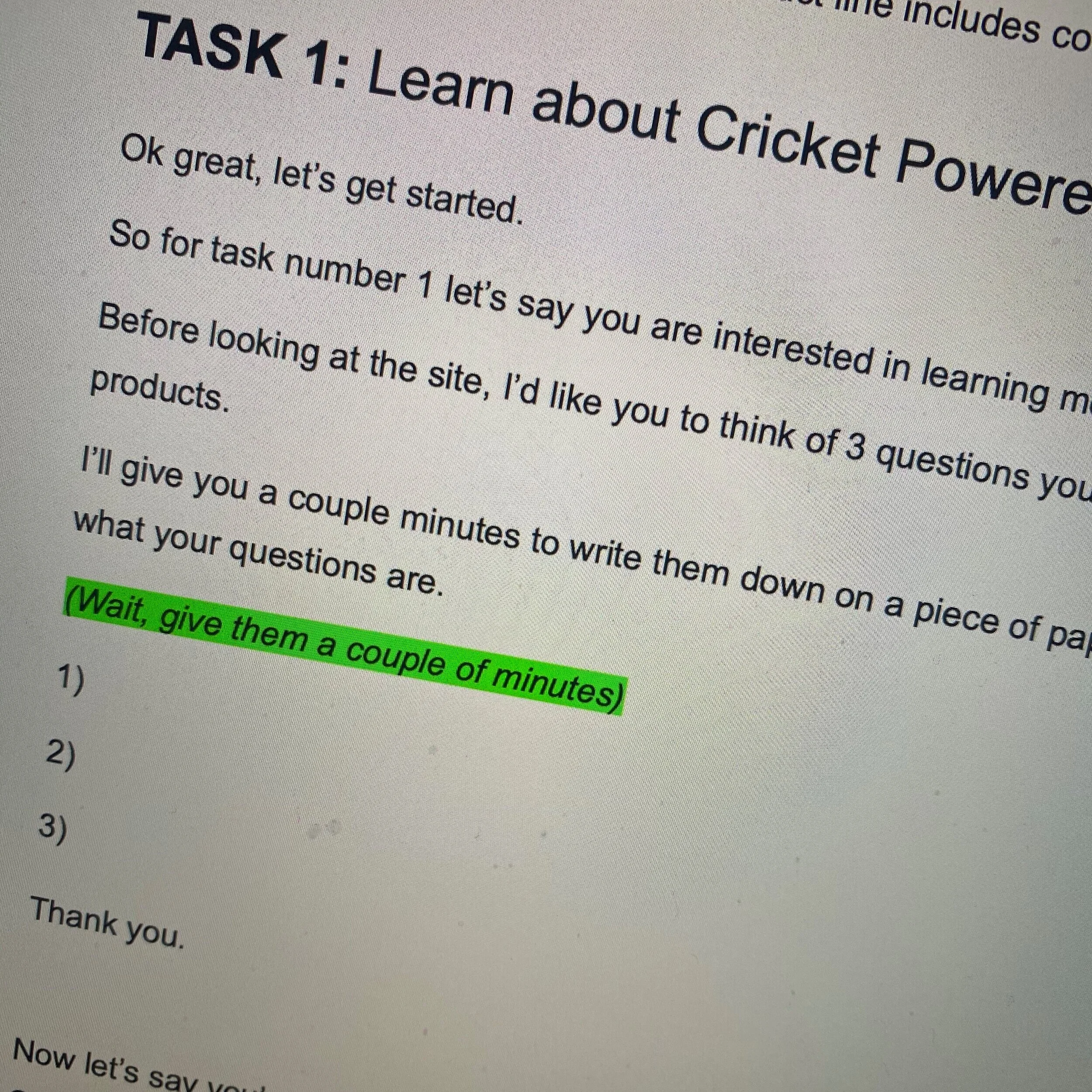
Currently: In our Usability Study, we asked research participants to write down 3 questions they have about crickets-as-food. With the current organization of the site, each one of our study participants had question they couldn’t find on the HCF website.
Observation: The hierarchy on the “Why Crickets Page” was confusing.
Recommendation: Changing the copy on the page into a standardized Hierarchy.

Legibility
Currently: Our research participants struggled with the legibility of some aspects of the site.
Observation: Clumps of text were unappealing to the eye and challenging to read.
Recommendation: Use lists and bullet points to make copy easier to read.

Engagement
Currently: When looking for nutritional information, participants could not enlarge or zoom in to the nutritional guide.
Observation: 11 of the 12 participants in our study found this very frustrating.
Recommendation: Upload a HD version of the nutritional information and place it outside of the text box, so shoppers can zoom in.

Transparency
Currently: While exploring the site, participants were very interested in learning more about the farm. They wanted to see photos of the farm learn about the process. The site did not have answers or photos of the farm.
Observation: This lack of transparency lead to some participants feeling like something was “off.”
Recommendation: Add photos of the farm and a FAQ page to the site.

Accessibility
Currently: Several Sections of the site had text shows as a .jpg image.
Observation: Screen reader can not read text when it is shown as a .jpg image.
Recommendation: Remove the .jpgs and insert the text directly into the site.

Branding
Currently: The Branding on the website was different from the branding on social media.
Observation: The “About” sections on the website and Facebook promoted separate aspects of the company.
Recommendation: Mirror the brand messaging and copy for a cohesive experience for the user.